
Previous | Next
|
|
Contents page Previous | Next |
TeeChart Pro will automatically define all Axis labelling for you and offers plenty of flexibility to tailor any specific requirements you may have. TeeChart Pro offers true Multiple Axes. These are available at design or run time and offer countless possibilities and flexibility for Axis definition. See the section in this tutorial for more information.
| Contents |
Axes control - Key areas
Scales Additional AxesCopying axesMultiple Custom axes Axis events |
Axis scales are set automatically when you add Series data to your Chart. You may change from the defaults at design time or at runtime by using Axis properties.
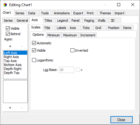 |
Automatic selects the best axis scale range to fit your data. If you turn Automatic off the Scales section will activate options and you can change Axis values. Important, remember to select the Axis that you wish to configure from the Axis menu on the left of the page. Add a Line Series to a Chart add a Command Button with the following code: procedure TForm1.BitBtn1Click(Sender: TObject);
var t: Integer;
begin
For t := 0 To 40 do
With Series1 do
begin
Add(Int(Random(t)), '', clRed);
end;
end;
Running the code in the button will draw a Line Series with 40 random values. |
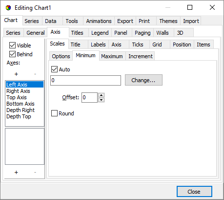 | Go to the Chart Editor at design time. Turn Automatic 'off' in the Bottom Axis scales section of the Axis page. You may now configure Maximum and minimum values for the Axis scale. Running the code again will show values depending on the values you configured for the Axis. Using the right mouse button you may scroll to see the remaining values. Setting axis scales by code
With Chart1.Axes.Bottom do
begin
  Automatic := False;
  Maximum := 36;
  Minimum ;= 5;
end;
|
 | You may set Axis scale Maximum and Minimum to automatic individually. eg: With Chart1.Axes.Bottom do begin AutomaticMaximum := True; Minimum := 5; end; |
You may tailor the intervals for the Axis. Select the Desired Increment combobox from the Scales section of the Axis page and add the increment you require. You may change this by code at runtime:
Chart1.Axes.Bottom.Increment := 20;
Datetime data
If your data is datetime (You may set the data to datetime for your Series by going to the Series, General page), the Chart, Axis
page and scales section will show a datetime range. Select from the range shown in the
Desired Increment combobox.
add some sample data
for t := 1 To 25 do
    Series1.AddXY(EncodeDate(2024, 4, t), Random(t), '', clRed);
Change the Increment at runtime:
Chart1.Axes.Bottom.Increment := DateTimeStep[dtOneWeek];
See the Axis.ExactDateTime property for more information about date axis labelling.
Note
When changing axis label frequency, bear in mind that TeeChart will avoid label overlap according to the setting of the LabelsSeparation property. This means that if the label frequency is too high for the labels to fit, then TeeChart will allocate 'best fit'. Changing the label angle and label separation are 2 options that may help you fit the labels you require. See the Labels section and LabelsAngle property.
Titles are set in the Titles section of the Axis page. You may change the Title text for the Axis and its font. The angle may be selected from values 0, 90, 180, 270 degrees. For runtime see the TChartAxisTitle Component.
Note
Label increment is influenced by best-fit but can be overriden by setting the increment specifically for any value other than 0 (best-fit). See Increment.
Label formats
You may apply all standard number and date formats to Axis labels. The Axis page, Labels section contains the field "Values format". If your data is datetime the field name changes to "Date time format". In the Editor drag the help "?" icon onto the field to get a full listing of options. at runtime use:
Chart1.Axes.Bottom.AxisValuesFormat := '#,##0.00;(#,##0.00)';

//or for Datetime data

Chart1.Axes.Bottom.DateTimeFormat := 'dd/mmm/yy hh:mm:ss';
MultiLine labels
Axis labels can be displayed as multi-line text instead of a single line of text.
Lines are separated using the TeeLineSeparator global constant, which by default is the carriage-return ascii character ( #13 ).
//Add the Series labels in this way and apply 'Marks' as Axis labelling style

Series1.Add( 1234, 'New'+TeeLineSeparator+'cars' , clRed );
Series1.Add( 2000, 'Old'+TeeLineSeparator+'bicycles' , clBlue );
Example for DateTime labels:
The following will show the Bottom Axis labels in two lines of text, one
showing the month and day, and the second line showing the year:
| Feb-28 | Mar-1 | .. |
| 2024 | 2024 | .. |
Series1.AddXY( EncodeDate( 2024,2,28 ), 100 );
Series1.AddXY( EncodeDate( 2024,3,1 ), 200 );
Series1.AddXY( EncodeDate( 2024,3,2 ), 150 );

Series1.XValues.DateTime := True;

Chart1.Axes.Bottom.DateTimeFormat := 'mm/dd hh:mm';   { <-- space }
If you set the LabelsMultiLine property to True, the axis will automatically split labels into separate lines where spaces are found.
Chart1.Axes.Bottom.LabelsMultiLine:=True;
Dividing the Label into two:
'mm/dd' for the first line
'hh:mm' for the second line
procedure TForm1.Chart1GetAxisLabel(Sender: TChartAxis;
  Series: TChartSeries; ValueIndex: Integer; var LabelText: String);
var s:string;
begin
    s:='abc'+TeeLineSeparator+'def';
    LabelText:=ReplaceChar(s,' ',TeeLineSeparator);
end;
The axis LabelsAngle property ( label rotation in degree angles 0, 90, 180 or 270 ), can also be used with multi-line axis labels.
Customising Axis labels
Further Label control may be obtained by using Axis events. The events permit you to activate/deactivate/change any individual Axis label. The following example modifies each Label, putting a textual phrase in front of the point index value.
//set LabelStyle to 'Mark' with the TChart editor or use:-
Chart1.Axes.Bottom.LabelsStyle := talMark;

//OnGetaxisLabel event
procedure TForm1.Chart1GetAxisLabel(Sender: TChartAxis;
  Series: TChartSeries; ValueIndex: Integer; var LabelText: String);
begin
 if Sender = Chart1.Axes.Bottom then
    LabelText := 'Period ' + IntToStr(ValueIndex);
end;
See the section entitled Axis events for more information about customising labels with Axis events.
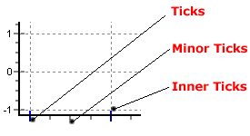 | There are 3 tick types. You can change the length, width and colour of each tick type. If the tick width is set to 1 (default) then you may change the style to one of several line types (dot, dash, etc.). Style will be ignored if width is greater than 1. |
With Chart1.Axes.Bottom do
Begin
  TickLength := 7;
  Ticks.Color := clGreen;
  MinorTickCount := 10; //change number of minorticks between (major) Ticks
end;
Axes have a property which modifies where each axis is to be located. In this example, the axis is moved to 50% of the total Chart width, so it is shown at the chart center:
Chart1.Axes.Left.PositionPercent := 50 ;
TeeChart offers 5 axes to be associated with data Series: Left, Top, Bottom, Right and Depth. When you add a new series to a Chart you may define to which of the axes the Series should be related (Go to the Series tab, General page). You may repeat any one (or all) of the 4 front axes at any place on the Chart by using the Axis Customdraw method. Note that this method makes a copy of your Axis, it does not add a new Custom Axis. See the next section, Multiple Custom Axes, for more information.
You will find this example, called "CustAxisProject1", with the TeeChart sample code:
//fill the Series for this example with random data
procedure TForm1.BitBtn1Click(Sender: TObject);
Var t:integer;
begin
  For t := 0 To 20 do
    Series1.AddXY(t, Random(100) - Random(70), '', clRed);
end;

//Put this code in the OnBeforeDrawValues() event:
procedure TForm1.Series1BeforeDrawValues(Sender: TObject);
var posaxis :Integer;
begin
  With Chart1 do
  begin
    If Axes.Left.Maximum > 0 Then
    begin

      //When scrolling or on zoom always keep the gridlines enclosed in the Chart rectangle
      Canvas.ClipRectangle(ChartRect);

      //Always draw the 2nd vertical Axis at the middle point of the Chart
      posaxis := (ChartRect.Left) + (ChartRect.Right - ChartRect.Left) div 2;
      Axes.Left.CustomDraw(posaxis - 10, posaxis - 20, posaxis, True);

      //Draw the 2nd Horizontal axis at the level of "10" on the vertical axis
      posaxis := (Axes.Left.CalcYPosValue(10));
      Axes.Bottom.CustomDraw(posaxis + 10, posaxis + 40, posaxis, True);

      Canvas.UnClipRectangle;
    end;
  end;
end;
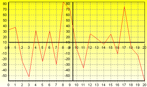 | Custom axes |
In this example, TeeChart will plot the New axes, one horizontal and one vertical in the centre of your Chart. When you scroll the Chart (dragging with right mouse button), the new vertical axis will always remain central to the Chart, the new horizontal axis will move up and down with vertical scrolling. The new axes are exact copies of the default axes.
Together with the PositionPercent and stretching properties, it’s possible to have unlimited axes floating anywhere on the chart. Scroll , zoom , and axis hit-detection also apply to custom-created axes. Creating extra axes is possible both at designtime via the Chart Editor and at runtime via a few lines of code:
Via the Chart Editor
TeeChart offers you the ability to create custom axes at designtime enabling them to be saved in TeeChart's tee file format. To achieve this, open the Chart Editor and click on the Axis tab and then select the "+" button to add a Custom Axis.
Then select the Position tab making sure you have your new Custom Axis highlighted. The Horizontal checkbox on this page allows you to define your new Custom Axis as an horizontal axis or to leave it as the default vertical axis.
The rest of this page and the other tabs in the Axis page can be used to change the Scales, Increment, Titles, Labels, Ticks, Minor Ticks and Position of the Custom Axis as explained above.
To associate this new Custom Axis with the Data Series you desire select the Series tab and go to the General page where the dropdown Comboboxes 'Horizontal Axis' and 'Vertical Axis' will enable you to select your new Custom Axis depending on whether you previously defined it as vertical or horizontal.
Via Code
Example
procedure TForm1.BitBtn2Click(Sender: TObject);
Var MyAxis : TChartAxis ;
begin
  MyAxis := TChartAxis.Create(  Chart1 );
  Series2.CustomVertAxis := MyAxis;

  //You can modify any property of the new created axes, such as the axis color or axis title
  With MyAxis do
  begin
    Axis.Color:=clGreen ;
    Title.Caption := 'Extra axis' ;
    Title.Font.Style:=[fsBold];
    Title.Angle := 90;
    PositionPercent := 20; //percentage of Chart rectangle
  end;
end;
You are able to then position the new Axis in overall relation to the Chart by using the StartPosition and EndPosition properties.
StartPosition:=50;
EndPosition:=100;
These figures are expressed as percentages of the Chart Rectangle with 0 (zero) (in the case of a vertical Axis) being Top. These properties can be applied to the Standard Axes to create completely partitioned 'SubCharts' within the Chart.
Example
  With Chart1.Axes.Left do
  begin
    StartPosition:=0;
    EndPosition:=50;
    Title.Caption:='1st Left Axis';
    Title.Font.Style:=[fsBold];
  end;
The above 2 coded examples when combined with the following data:
var t: integer;
begin
  for t := 0 to 10 do
  begin
    Series1.AddXY(t,10+t,'',clTeeColor);
    if t > 1 then
      Series2.AddXY(t,t/2,'',clTeeColor);
  end;
...will show the following Chart:
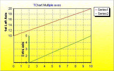 | Multiple axes |
Another technique for adding Custom Axes would be the following which uses the Axis List as the focal point by using the List Add then by accessing the Axis by Index:
//Add data to Series:
procedure TForm1.FormCreate(Sender: TObject);
begin
  Series1.FillSampleValues(10);
  Series2.FillSampleValues(10);
end;

procedure TForm1.BitBtn1Click(Sender: TObject);
var
 tmpVertAxis: TChartAxis;
 tmpHorizAxis: TChartAxis;
begin
  {Add vertical Axis}
  Chart1.CustomAxes.Add;
  tmpVertAxis:=Chart1.CustomAxes[0];
  tmpVertAxis.PositionPercent:=50;
  Series1.CustomVertAxis:=tmpVertAxis;

  {Add horizontal Axis}
  Chart1.CustomAxes.Add;
  tmpHorizAxis:=Chart1.CustomAxes[1];

  tmpHorizAxis.Horizontal:=True;
  tmpHorizAxis.Axis.Color:=clGreen;
  tmpHorizAxis.PositionPercent:=50;
  Series1.CustomHorizAxis:=tmpHorizAxis;
end;
Options are limitless! We advise caution when using Custom Axes as it is easy to start filling the screen with new axes and to lose track of which one you wish to manage!
Axis events offer runtime flexibility to modify Axis Labels and offer interactivity to the user on Axis Clicks.
See the OnClickAxis event.
Example
procedure TForm1.Chart1ClickAxis(Sender: TCustomChart; Axis: TChartAxis;
  Button: TMouseButton; Shift: TShiftState; X, Y: Integer);
begin
  //Shows Axis point clicked when click on Bottom Axis.

  if Axis = Chart1.Axes.Bottom Then
     ShowMessage('Clicked Bottom Axis at '  + FloatToStr(Chart1.Axes.Bottom.CalcPosPoint(X)));
end;
Can be used to modify Axis Labels. See the OnGetAxisLabel event.
Example
procedure TForm1.Chart1GetAxisLabel(Sender: TChartAxis;
  Series: TChartSeries; ValueIndex: Integer; var LabelText: String);
begin
  if Sender = Chart1.Axes.Bottom Then
     Case StrToInt(FormatDateTime('mm', StrToDate(LabelText))) of
       1,2,3 : LabelText := '1st Qtr';
       4,5,6 : LabelText := '2nd Qtr';
     end;
end;
Can be used to decide which Axis Labels should be displayed. See the OnGetNextAxisLabel event. You should use the Stop Boolean property to include/exclude Axis Labels.
Example
procedure TForm1.Chart1GetNextAxisLabel(Sender: TChartAxis;
  LabelIndex: Integer; var LabelValue: Double; var Stop: Boolean);
begin
  Stop:=False;

  if Sender = Chart1.Axes.Bottom Then
  begin
    if LabelValue>=5 then LabelValue:=LabelValue+5
                     else LabelValue:=5;
  end
  else
    Stop:=True;

end;
The above example will start labelling at '5' on the Bottom Axis labelling every 5 points. Other Axes' Labels are unaffected.
 |
 |