Tutorial 2 - Chart Display Properties
Chart display features are those which affect the overall appearance of the Chart. They include those properties and methods that define the colour of the Chart background, Titles and their position, margins, borders and bevels, background images, frame and axis visible, pen colours and widths, 3D, walls, etc. Nearly all these properties are available via the TeeChart Editor at design or runtime and you may modify these properties programmatically at runtime. The overall Chart appearance characteristics are a grouped into these categories:
General
Axis
Titles
Legend
Panel
Paging
Walls
3D
These are the groupings you will find if you open the TeeChart Editor and browse the Chart pages. Other properties affect the 'look' of your Chart. These include Series colours and mark characteristics, individual Axis and Grid display properties and labelling. These will be dealt with in later tutorials dedicated to the specialist role of these features.
Getting started with Chart display properties
Add a new Chart to a Form and you will see it displays in 3D with a grey panel background, 2 walls (Bottom and Left), Frame (which defines the Frame of the Chart's plottable area) and a default Chart Title Header "TeeChart".
Right click on the chart and select 'Edit ...' from the menu to access the TeeChart Editor. The first page is the Series page which is empty and doesn't interest us for this tutorial. Select the third Chart tab 'General' to access the General Chart properties page.
General Chart properties
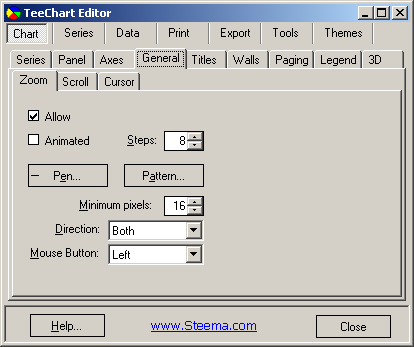
General options include the 3 following sections:
Zoom
Scroll
Cursor
Zoom and Scroll are dealt with in a later tutorial
Axis Properties
Control of the axes is quite a specialised area at its greatest level of intricacy and is dealt with in greater depth in a later tutorial. Here we will cover the fundamentals of Axis and Frame display. The second Chart page holds the properties for defining axis and frame characteristics.
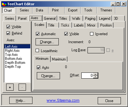
There are 6 principle axes in the Chart. Left, Top, Right, Bottom, Depth Bottom and Depth Top. The Chart Frame displays as a surround to the Chart's plottable area and has no data corresponding features (See BackWall). The Depth initialises by default as not Visible. All other Axes are visible from the moment that a Series is added to the Chart and associated with those Axes (Left and Bottom as default). Custom Axes may be added/removed by using the + and - keys on the dialogue. For a Custom Axis to be visible (as for any other Axis) a Series must be associated with the Axis. See the Axis tutorial for more about Custom axes.
The key properties to enable display of axes and frame are:
Visible
This checkbox enables or disables display of all axes. If the Back wall Frame is visible then the Chart surround is still visible when the axes are hidden. The result will be the appearance of a larger Chart as no area is reserved for the axis labels. The Visible property for each Axis (Scales tab) overrides the visible characteristic for each Axis. If you select the Depth Axis in the List then you will note that Depth Axis Scales.Visible is by default 'not visible'.
[C#.Net]
tChart1.Axes.Visible = true;

[VB.Net]
TChart1.Axes.Visible = True
Axis: Left, Right, Top, Bottom and Depth Visible
Select the Axis that you wish to display or hide in the Listbox and toggle the Visible checkbox on the Scales tab to control the display for that specific axis.
[C#.Net]
tChart1.Axes.Left.Visible = true;

[VB.Net]
TChart1.Axes.Left.Visible = True
Titles Properties
The Titles page of the TeeChart Editor controls the characteristics of the Chart Titles, Header and Footer. 
Text
Use the dropdown Combobox to select either Title (Header), SubTitle, Foot or SubFoot. Enter the required text in the Textbox. You may type multiline titles.
Runtime:
The Text property of the Header class is a standard .Net String class and can be modified as such, e.g.
[C#.Net]
tChart1.Header.Text = "My Header Text";

[VB.Net]
TChart1.Header.Text = "My Header Text"
Style Alignment
Alignment refers to the Header (or Footer) alignment with respect to the Chart area NOT the overall Chart Panel. The Chart area is the plottable area of the Chart plus Axis Labels and Legend.
Runtime:
[C#.Net]
tChart1.Header.Alignment = StringAlignment.Far;

[VB.Net]
TChart1.Header.Alignment = StringAlignment.Far
Position
Use Position to override the Title or Footer default position and set a custom position (pixels relation to Chart Top, Left).
Runtime:
[C#.Net]
tChart1.Header.CustomPosition = true;
tChart1.Header.Top = tChart1.Header.Top + 10;

[VB.Net]
TChart1.Header.CustomPosition = True
TChart1.Header.Top = TChart1.Header.Top + 10
Format
Contains the settings for the Title box, e.g. Color of the box, Pen properties of the Frame around the box, Brush properties [Pattern] of the box, etc.
e.g. Pattern
Pattern refers to the background pattern [solid, hatch, gradient or image] of the Title or Footer box.
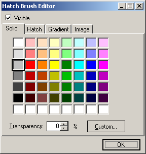
The default is Transparent, meaning that the Title box is not visible until the Transparent check-box is unchecked.
Runtime:
[C#.Net]
tChart1.Header.Transparent = false;
tChart1.Header.Brush.Style = System.Drawing.Drawing2D.HatchStyle.Cross;

[VB.Net]
TChart1.Header.Transparent = False
TChart1.Header.Brush.Style = System.Drawing.Drawing2D.HatchStyle.Cross
Text
Contains the Title Text appearance formatting characteristics.
e.g. Font
The Font button will grant access to the Font Dialog window which allows selection of Windows Fonts and definition of style (italic, bold, etc.) and colour.
Runtime:
[C#.Net]
tChart1.Header.Font.Name = "Verdana";
tChart1.Header.Font.Bold = true;

[VB.Net]
TChart1.Header.Font.Name = "Verdana"
TChart1.Header.Font.Bold = True
Shadow
Properties for display of the Header or Footer box Shadow. You may define colour and ChartBrush [solid, hatch, gradient or image].
Runtime:
[C#.Net]Bevels
tChart1.Header.Shadow.Visible = true;
tChart1.Header.Shadow.Color = Color.Chartreuse;
[VB.Net]
TChart1.Header.Shadow.Visible = True
TChart1.Header.Shadow.Color = Color.Chartreuse
Defines the Bevel properties of the Header or Footer box.
Legend Properties
Legend contents are a specialist subject that will be dealt with in a later tutorial. In the Legend page of the TeeChart Editor you may define appearance aspects of the Legend. Important initial steps are to control Legend alignment and visible properties, colour, font, frame, shadow, etc.. 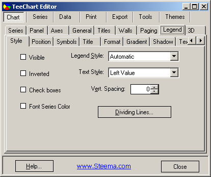
Style
Toggle On/Off Legend display and set Legend display content characteristics (inclusion of Checkboxes, etc).
Runtime:
Example using Checkbox to control Legend display:
[C#.Net]%Dividing Lines
private void checkBox1_CheckedChanged(object sender, System.EventArgs e)
{
if(checkBox1.Checked)
{tChart1.Legend.Visible = true;}
else
{tChart1.Legend.Visible = false;}
}
[VB.Net]
Private Sub CheckBox1_CheckedChanged(ByVal sender As Object, ByVal e As System.EventArgs) Handles CheckBox1.CheckedChanged
If CheckBox1.Checked Then
TChart1.Legend.Visible = True
Else
TChart1.Legend.Visible = False
End If
End Sub
Used to draw lines within the Legend box between the Legend entries. ChartPen properties apply.
Runtime:
[C#.Net]
tChart1.Legend.DividingLines.Visible = true;
tChart1.Legend.DividingLines.Color = Color.Blue;

[VB.Net]
TChart1.Legend.DividingLines.Visible = True
TChart1.Legend.DividingLines.Color = Color.Blue
Position
Sets the default display position or enables custom positioning of the Legend. TChart will change the shape of the Legend to fit the location. If the Legend is set to the side (left or right) of the Chart the contents of the Legend, by default, sit as a list from top to bottom. If the Legend sits below or above the Chart then the Legend contents are placed side by side. The default behaviour may be overridden by using the Resize Chart option and/or by using Custom positioning. See the Legend tutorial for more about custom positioning of the Legend.
e.g. ResizeChart
Resize Chart defines whether or not the Chart will leave space for the Legend when it paints. This allows the Legend to be placed within the Chart area.
Runtime:
[C#.Net]
tChart1.Legend.ResizeChart = true;

[VB.Net]
TChart1.Legend.ResizeChart = True
%Top position
Defines the Legend box displacement from the top of the Chart Panel.
Runtime:
[C#.Net]
tChart1.Legend.CustomPosition = true;
tChart1.Legend.Top = 5;

[VB.Net]
TChart1.Legend.CustomPosition = True
TChart1.Legend.Top = 5
Symbols
Size and formatting of the Legend symbols.
%Color Width
Defines the width of the colour boxes within the Legend.
Runtime:
[C#.Net]
tChart1.Legend.Symbol.WidthUnits = LegendSymbolSize.Pixels;
tChart1.Legend.Symbol.Width = 30;

[VB.Net]
TChart1.Legend.Symbol.WidthUnits = Steema.TeeChart.LegendSymbolSize.Pixels
TChart1.Legend.Symbol.Width = 30
Format
Contains the settings for the Legend box, e.g. Colour, Frame (ChartPen properties), Pattern (ChartBrush properties), and checkboxes for Round Frame and Transparent.
Text
Text characteristics for the Legend text contents and its shadow.
Runtime:
[C#.Net]
private void button1_Click(object sender, System.EventArgs e)
        {
            Legend legend1;
            legend1 = tChart1.Legend;
            legend1.Color = Color.Blue;
            legend1.Font.Name = "Times New Roman";
            legend1.Font.Color = Color.Yellow;
        }

[VB.Net]
Private Sub Button1_Click(ByVal sender As System.Object, ByVal e As System.EventArgs) Handles Button1.Click
        With TChart1.Legend
            .Color = Color.Blue
            .Font.Name = "Times New Roman"
            .Font.Color = Color.Yellow
        End With
End Sub
Gradient
Enable/disable a Background Gradient in the Legend box and select its direction and colours.
Shadow
Properties for display of the Legend box Shadow. You may define colour, pattern (ChartBrush) size and transparency.
Runtime:
[C#.Net]Bevels
tChart1.Legend.Shadow.Color = Color.Cyan;
tChart1.Legend.Shadow.Width = 4;
[VB.Net]
TChart1.Legend.Shadow.Color = Color.Cyan
TChart1.Legend.Shadow.Width = 4
Properties for colour and size of inner and outer bevels.
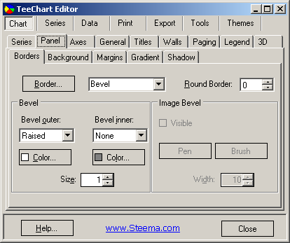
Panel Properties
The TeeChart Panel page allows you to set parameters which greatly enhance the appearance of the Chart. Panel Gradient effects are best seen by monitors that support true colour. By now you are familiar with TeeChart properties so we won't run through all the properties here. Panel properties and methods may be accessed via the Panel interface:
Key areas are:
Borders
You may define Border independently or in conjunction with the Bevel properties. Mixing Bevel and Border and manipulating Width gives almost any combination of 3D effects.
e.g. Bevel Inner/Bevel Outer/Border Width
These properties will produce a variety of 3D effects on the Border of the Chart panel. Modify them at design time to see how they affect the Chart border bevels.
Background
e.g. Panel Color
Panel colour will paint the whole Chart background with the chosen colour. If you select to view a background Gradient or Image they will hide the Panel colour. If you set a Back colour it will replace the Panel colour within the Chart Frame only.
e.g. BackImage
You may select any bitmap file as a BackImage. Using the Hatch Brush Editor (from the Pattern button) there are five different Wrap Modes to choose from for the BackImage.
Runtime:
Use ChartBrush.LoadImage to add a background image to a Chart at runtime.
[C#.Net]Margins
tChart1.Panel.Brush.WrapMode = System.Drawing.Drawing2D.WrapMode.TileFlipXY;
tChart1.Panel.Brush.LoadImage(@"C:\...\MyImage.jpg");
[VB.Net]
TChart1.Panel.Brush.WrapMode = System.Drawing.Drawing2D.WrapMode.TileFlipXY
TChart1.Panel.Brush.LoadImage("C:\...\MyImage.jpg")
Margins are defined as the distance between the Chart Border and the Chart Frame and are expressed as a percentage of the overall dimensions of the Chart Panel.
Moving the spin boxes in the Chart Editor Margins box will show you at design time the effect of changing each Margin.
Runtime properties are:
TChart1.Panel.MarginTop
TChart1.Panel.MarginLeft
TChart1.Panel.MarginRight
TChart1.Panel.MarginBottom
You could use a HScrollbar to alter these properties:
[C#.Net]
private void Form1_Load(object sender, System.EventArgs e)
        {
            bar1.FillSampleValues(10);
            hScrollBar1.Value = Convert.ToInt32(tChart1.Panel.MarginLeft);
            hScrollBar1.Maximum = 80;
        }

private void hScrollBar1_Scroll(object sender, System.Windows.Forms.ScrollEventArgs e)
        {
            tChart1.Panel.MarginLeft = Convert.ToDouble(e.NewValue);
        }

[VB.Net]
Private Sub Form1_Load(ByVal sender As System.Object, ByVal e As System.EventArgs) Handles MyBase.Load
        Bar1.FillSampleValues(10)
        HScrollBar1.Value = TChart1.Panel.MarginLeft
        HScrollBar1.Maximum = 80
End Sub

Private Sub HScrollBar1_Scroll(ByVal sender As Object, ByVal e As System.Windows.Forms.ScrollEventArgs) Handles HScrollBar1.Scroll
        TChart1.Panel.MarginLeft = e.NewValue
End Sub
Gradient
To define a Gradient you must select a StartColor and EndColor (plus, optionally MidColor) and enable as Visible the Gradient. The Gradient will cover the whole Chart panel. Gradient direction defines the direction of colour change between Start, Mid and EndColor.
Runtime:
[C#.Net]
tChart1.Panel.Gradient.Visible = true;
tChart1.Panel.Gradient.StartColor = Color.Red;
tChart1.Panel.Gradient.MiddleColor = Color.White;
tChart1.Panel.Gradient.EndColor = Color.Blue;
tChart1.Panel.Gradient.Direction = System.Drawing.Drawing2D.LinearGradientMode.ForwardDiagonal;

[VB.Net]
With TChart1.Panel
         .Gradient.Visible = True
         .Gradient.StartColor = Color.Red
         .Gradient.MiddleColor = Color.White
         .Gradient.EndColor = Color.Blue
         .Gradient.Direction = System.Drawing.Drawing2D.LinearGradientMode.ForwardDiagonal
End With
Shadow
Defines the size, colour, pattern (ChartBrush) and transparency properties of the Chart panel's shadow.
Paging Properties
TeeChart paging allows a Chart to be divided into a set number of points per page and for the Chart to be leafed through. See the Paging tutorial for more information. 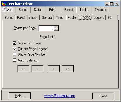
Walls Properties
This page in the Chart section of the Chart Editor applies properties to the Chart Walls. There are 4 Walls: Left, Right, Bottom and Back, that may be represented in 2D or 3D. Wall properties are accessible via the TChart1.Walls property.
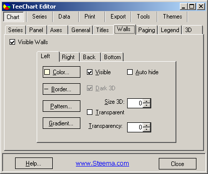
Color
The color button takes you to the Color Editor which enables you to choose a colour for the selected wall.
Border
The Border button takes you to the ChartPen definition for the Walls class. This is the same Pen available for many other TeeChart objects.
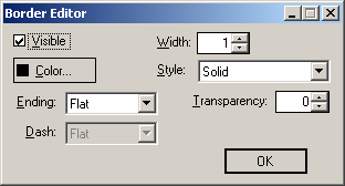
The visible property enables/disables display of the Border. In the case of the BackWall, where axes are Visible the Wall Border will be hidden behind those axes so you will only see the result of enabling/disabling the Border if you hide some or all axes (e.g. Make axes Top and Right invisible to see the result of changing the colour of Wall Border i.e. TChart1.Walls.Back.Pen.Color = Color.Blue).
See ChartPen for other characteristics of the Border Pen. You can change these properties at design time.
Pattern
The Pattern button takes you to the ChartBrush definition for the Walls class. This is the same Brush available for many other TeeChart objects.
Gradient
The gradient button takes you to the Gradient Editor which enables you to choose a gradient for the selected wall.
3D
3D is extremely flexible in TeeChart Pro. You now have the option to display the Chart as: 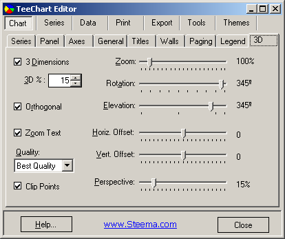
3 Dimensions
Selecting this property (toggling) will change the Chart from a 3D to a 2D Chart in design time and the setting will take effect for runtime.
3D %
Controls the depth of the 3D effect. Changing the value of this property will show you at design time the effect of changing the 3D percentage.
An applied example of these properties uses a CheckBox and Horizontal ScrollBar:
[C#.Net]
private void checkBox1_CheckedChanged(object sender, System.EventArgs e)
        {
            if(checkBox1.Checked)
            {
                tChart1.Aspect.View3D = true;
                hScrollBar1.Enabled = true;
            }
            else
            {
                tChart1.Aspect.View3D = false;
                hScrollBar1.Enabled = false;
            }
        }

private void hScrollBar1_Scroll(object sender, System.Windows.Forms.ScrollEventArgs e)
        {
            tChart1.Aspect.Chart3DPercent = e.NewValue;
        }

[VB.Net]
Private Sub CheckBox1_CheckedChanged(ByVal sender As Object, ByVal e As System.EventArgs) Handles CheckBox1.CheckedChanged
        If CheckBox1.Checked Then
            TChart1.Aspect.View3D = True
            HScrollBar1.Enabled = True
        Else
            TChart1.Aspect.View3D = False
            HScrollBar1.Enabled = False
        End If
End Sub
Private Sub HScrollBar1_Scroll(ByVal sender As Object, ByVal e As System.Windows.Forms.ScrollEventArgs) Handles HScrollBar1.Scroll
        TChart1.Aspect.Chart3DPercent = e.NewValue
End Sub
The Orthogonal Option, when disabled, enables Windows Native 3D mode allowing you to Rotate, Elevate and offset the Chart. The Zoom option allows you to bring forward or move away the whole Chart. Zoom internally in the Chart on Data Series is still available at runtime.
The Perspective property allows you to set a distance perspective as if looking into a room. Perpsective offers a visual enhancement for Charts used for presentation purposes. For a further reference on 3D options take a look at Tutorial 15 - Chart 3D.